
WiFi access point usage on the RPI campus
RPI SafeCampus reveals WiFi access point usage and aggregations of wireless users on the campus network at Rensselaer Polytechnic Institute.
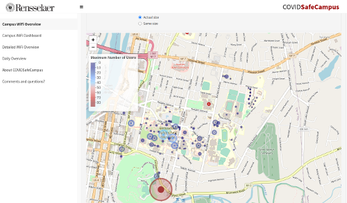
CAMPUS WIFI OVERVIEW
- This tab reveals the usage of Wi-Fi access points on the campus network at RPI.
- Users can customize their searches using the following 4 selections:
- View the WiFi access via user count or device count.
- Select a specific date within the last 7 days.
- Specify the 30 minutes interval they wish to view.
- Refine their searches by only selecting specific building types.
- Select to view the bubbles where their size reflects the exact number of maximum users/devices or their sizes are all the same so that the bubbles are only differentiated by color.
- Based on the user's selection, the main panel will display a bubble map.
- The color of each bubble represents whether there is a high or low maximum number of users at that specific building during the given time interval.
- The diameter of each bubble represents the maximum number of users at that specific building during the given time interval.
- The user can click on each bubble to view the building name, maximum number of users, and average number of users during the given time interval.
CONTINUOUS DATA OVERVIEW
- This tab provides an overview of the WiFi access on campus via WAP devices.
- Users can customize their searches using the following 4 selections:
- View the WiFi access via user count or device count.
- Select a specific date within the last 7 days.
- Select a specific or multiple buildings.
- Refine their searches by only selecting from specific building types.
- Based on the user's selection, the main panel will display a heatmap showcasing the WiFi access per WAP device.
CAMPUS WIFI DASHBOARD
- This tab provides an overview of the WiFi access on campus via WAP devices in 30 minute intervals.
- Users can customize their searches using the following 5 selections:
- View the WiFi access via user count or device count.
- Select a specific date within the last 7 days.
- Select a specific or multiple buildings.
- Refine their searches by only selecting from specific building types.
- Specify the 30 minutes interval they wish to view the information.
- Based on user's selection, the main panel will display 4 plots showcasing a main heatmap displaying the WiFi access per WAP device at every 30 minutes interval, 2 aggregate bar plots showing the WiFi access per WAP device and every 30 minutes, and a plot of the WiFi access at each 30 minutes interval modeled by a polynomial function.
WEEK OVERVIEW
- This tab provides an overview of the WiFi access on campus via WAP devices over a specified date range.
- Users can customize their searches using the following 4 selections:
- View the WiFi access via user count or device count.
- Refine their searches by only selecting from specific building types.
- Select a specific date range to plot.
- Select a specific building.
- Based on the user's selection the main panel will display a bar plot showcasing WiFi usage for a specific building over the input date range.
Project Resources
Parent Projects